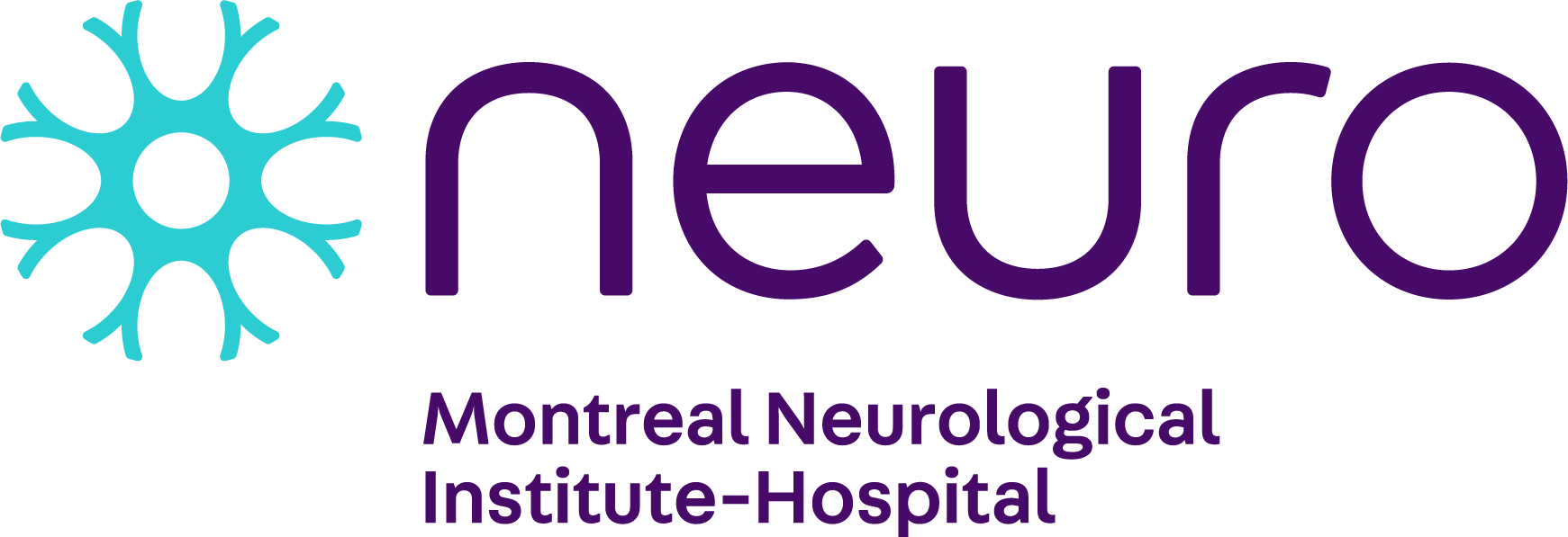
The Neuro (Montreal Neurological Institute-Hospital) is proud to unveil its new visual identity, to mark the start a new era with a renewed vision and the launch of Brains Need Open Minds, its largest fundraising campaign ever. The new logo, brand awareness and fundraising campaign puts people at the centre of everything we do.
“The Neuro is once again leading the charge on developing a new way of doing research and caring for patients – we are transforming neurological research and care to change lives. The new logo and branding embody this unique momentum and renewed vision that reflect our patient-centered mission, as well as the collaborative and open-minded approach that drives us all in our day to day,” says Dr. Guy Rouleau, Director of The Neuro.
Developed in partnership with marketing agency BrandBourg, the new logo and colour palette are a significant shift from The Neuro’s old visual identity. The new logo contains a rosette that represents a neuron and eight human figures coming together with a shared head at the centre. The rosette reinforces The Neuro’s core institutional values that are driven by the empowerment of our collaborative multi-disciplinary teams of researchers, clinicians, ambassadors, volunteers, patients, and the synergy between them. In symbolizing a neuron, the rosette reinforces The Neuro’s field of expertise and its position as a global leader not only in the neurosciences but also as the world’s first academic institution to embrace fully Open Science.
The Neuro has also shifted to a bold, contrasting colour palette of orange, blue and purple. The orange represents the institute’s expertise, the blue captures the hospital’s caring aspect, and purple expresses the conscientious dimension. All play an essential role in our mission and our achievements.
The connection between laboratory science, clinical investigation and patient care is a strength of The Neuro. It has helped enhance our place in the world of neurology, neurosurgery and neuroscience research. We are now profoundly redefining the way we work, by reshaping scientific research and the way it is shared. We believe our Open Science systems and tools will accelerate scientific progress towards solving the most persistent problems in neuroscience, to accelerate discovery, and impact the lives of millions of patients around the world.
"We are very proud to launch The Neuro's new identity, which is now perfectly aligned with our DNA,” says Damien Chalaud, The Neuro’s Senior Director of Communications. “This revamp was necessary given our strategic orientations and it makes us even more proud to belong to this venerable institution. Congratulations to the entire BrandBourg team who accompanied us in this process.”
"Identity creation is a reflection of the people who are building the organization: clarity, distinctiveness and breadth of scope," says Benoît Giguère, Vice-President, Creative and Content at BrandBourg. “We are proud to have updated The Neuro’s identity to capture their vision"
For our full visual identity guidelines, click here.


